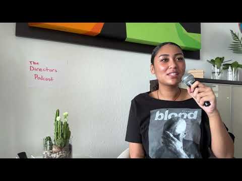
Hi blog! Luckily I was able to finish filming AND editing my reflection yesterday. So, now I have more time to plan for my "podcast". I actually began making the script on Monday before I found out I couldn't film it on Tuesday, so luckily I had a foundation already of what to do.
Two hosts on the podcast will ask me about how my film follows genre conventions and how it stands out, how it represents teenagers or issues, how it engages with my audience, and how it will be distributed. I made up the scenario that I just posted the trailer and will be posting my full film very soon. Since it's only a clip of a podcast, I decided to not include much of an introduction and a simple fade out at the end.
I also linked the websites that I directly mentioned in my script, and will mention more examples during editing. I mentioned my favorite video of all time (Breaking down the opening sequence of The Half of It), and I also mentioned a website named Gruvi (linked here) that helped me come up with distribution methods.
It took me almost the entire day to make, but here is one of my creative critical reflection videos!! The other one (technically the first one) will be made later in the week.
Now that it's spring break, I wanted to use this week to work on my creative critical reflections and have them done before this weekend. This was my overall schedule:
Monday: Plan for CCR #1
Tuesday: Film CCR #1
Wednesday: Edit CCR #1, Plan for CCR #2
Thursday: Film CCR #2
Friday: Edit CCR#2
The CCR #1 was the podcast I was originally planning on doing. I wanted to make up a casual podcast with two film creators as hosts discussing overall movies. However, I wanted my video do be an "extraction" of the podcast from where the other director asks me questions about my recent film, Dear Mara. This is where I ask two questions where I go more in depth, and will most likely be longer. I wanted my friends Andreina and Nicole to be featured in this, since they are also working on their film opening, making it a little bit more realistic. However, due to scheduling conflicts, we can't film together on Tuesday. So, what I decided to do is swap the schedule. This means that I'll plan for the CCR #2 today, and film it on my own tomorrow.
What I came up with for my second CCR was to make a behind-the-scenes video of the film. While I am being interviewed and discussing parts of the film, there will be clips of "behind the scenes" in the background. I still have every blooper on my phone, so getting the footage won't be hard. This idea is mostly inspired by the BTS videos that Marvel movies typically have. An example is shown here:
In this video, I'll be answering these two questions:
How did your production skills develop throughout this project?
How did you integrate technologies - software, hardware, and online - in this project?
I created a script for the video, linked here. I'm not sure if I wrote too much or too little, but this will be figured out and modified once I film. I'm planning for the producer to be called Alexandra, and the video editor to be called Alex, who will have a beard (creative, right?). I'll update my filming process tomorrow!
After coming back from a very nice vacation, it's time to get right back to work! I still have some video fixing to do before moving onto my CCRs.
First, I needed to create the messages onscreen. This part originally worried me because I didn't know where to start or what to say. Luckily, after talking with Andrea, she created a conversation between an unknown person and Mara for me to add.
From there, I created a conversation on Messages by texting myself and deleting the extra messages. I imported the picture into Adobe After Effects to animate them.
Along with this screenshot, I also imported the video so I can add it right away to the animation of the messages. This lets me place the texts in the right position a lot easier. From there, I removed the background of each message and used keyframes for the messages to move up and fade in. I also added a drop shadow so it matched the rest of the credits in the film.
Here is the final video I exported to add to my project in Premiere Pro:
With Lucia's recommendation, I also extended the clip with the title. This way, it makes the title stand out more compared to the rest of the credits.
We also fixed the "Blanks" and the "Actress name" problem. Using generators online, including a business name generator (found here), we were able to create a distribution company, production company, and three actresses.
Distribution company: Reel Magic Entertainment
Production company: Silver Screen
Starring: Aurora Sterling, Luna Everly, Nova Monroe
I also wanted to add that our shower problem is fixed!! We originally couldn't film anything until I went to Andrea's house and did it because Andrea had her nails painted. However, her nail polish is off now, so there's barely a difference between our hands. She was able to record this on her own and send it to me for editing, making it a lot easier and giving us more time for the rest of editing.
The final part of the video I changed is the font of the credits. Lucia also recommended to make the font look more bold, which would make it look more professional and nice. We tried the one she originally found, but it seemed too unserious for the mood we are going for. So, I found a font that was also bold, but more professional. It's called "Alternate Gothic No2 D", and I found it in Premiere Pro. After trying it for our credits, we believe it's a good fit. However, this took some effort to change, including needing to remake the idea I had with Mara closing the door. However, I think this effort was worth it to make our video look good, and for everyone to feel happy with it.
I won't show a preview, because once the audio is finished, we're done with the opening! From here, it's time for me to move on to my creative critical reflections, while also making sure everything in the film opening is doing well!
Since yesterday, I've been working a while on editing the video. I added the rest of the text in the right order, along with the animation of the title. The only clip we're missing is the clip of Mara turning on the shower, which we'll be filming on Sunday. This weekend, Andrea, Lucia, and I will see what looks off or messy. Here is what we have so far:
With this video, we could see what audios we could add and when. I made notes which watching the video to see exactly what sound effects we need, besides the music. This way we can completely understand what we're doing before we start editing the audio, just like the storyboard for the video. I included a timestamp for each sound, and from there listed which sounds we need overall. We can either find them through a sound library, or record it ourselves.
As we're nearing the end of the "due date" for our video (Sunday), we might be a bit behind. However, we agreed to come up with a production and distribution company. This way, it'll look more professional compared to the "IDK" and blank space we have now. We're also filming the shower video on Sunday. After the feedback, company replacement, replacing the clip, AND adding the audio, we'll be finishing off our video and beginning our CCRs!
Throughout this project, obviously the schedule has been pretty messy. Even though we're on track, we haven't been following the strict schedule. Speaking of, the editing was supposed to be due today (even though I've pretty much only combined the clips together). However, even with these messy "due dates", I think we'll still be finished before this weekend. I won't be able to work from Thursday to Sunday (vacation!! yay!) so I should pick up the pace and finish editing by then.
Today I focused on text again. Specifically, I picked out my font for the credits and animated the title!! I originally tried it on Adobe Premiere Pro, but got frustrated easily. So, I switched to After Effects, a platform I'm more comfortable with when it comes to animation. Luckily, on After Effects, I didn't need a tutorial or anything because of prior knowledge. Here's how I did it:
1. Write out the text on a text layer. Then, trace the letters by adding masks (lines) over the text.
2. Add the "stroke" effect
check all masks
change the brush thickness (to make it look like the original font)
set the paint style to "reveal original image"
3. Keyframe the "end" from 0% in the beginning to 100% where you want it to stop writing
4. (optional) Change the graph of the transition to make it flow more smoothly. In my case, I shifted it a little bit to the left so it goes faster in the beginning and slows down around the end.
5. Render it and add it to the video!! This is the animation I got after exporting it from After Effects.
I also wanted to update more about the video and the problems I was facing. I chose a very basic font for the credits, Plantagenet Cherokee, which I found on Premiere Pro. I'm using different sizes within the text so they all fit within the same family yet have some variation. We decided on making the "denial" font also very simple, as a stage of grief doesn't have as much as an emotional connection compared to writing a letter to your sister. Instead, the text is more like a divider or a timestamp, meaning it should be simple, clear, and bold.
We were also trying to film the additional clips that we forgot to originally film. We also wanted to include a scene of the shower running, and keep the shower running throughout the end of the video (until it gets to denial). I gave Andrea the original papers we originally used for the medium shot of the letter so she could rearrange them just the way we did before. She was able to do this and filmed a close-up that could fit well for in between Mara staring at the mirror and being on the floor. We also asked her to film a scene of her hand turning on the shower, but we didn't realize how complex it would be. Andrea's hand simply looks different than mine, including her painted nails. We tried to film a scene without her nails showing, but it was almost impossible. The lighting in my shower is also much different than hers, so me filming at my house wouldn't work either. We decided that, even though it isn't ideal, we could record that final scene on Sunday. This hopefully won't delay us much.
Before adding the text to the video, I wanted to see which fonts would work best for the title and credits. I also want to see if I should also have a different font for the "denial" text.
I looked around for websites that could help me find a perfect title font. After searching for a while, I realized there most likely is no set formula to how to find a font for your film. Everything depends on the genre, context, mood, and audience. However, I found a few useful tips from websites such as Action VFX and Drizy Studio.
make sure everything is legible
choose fonts from the same family, but varying in weight
pair fonts - one that works for credits and one for the title
get feedback from others
So, I'll need to look for fonts after researching common fonts in coming of age films.
Titles
For coming of age films, I noticed two common trends. Many films in that category use a very basic, easy-to-read font for their title. This is most likely the easiest way to attract the teenage audience and keep the title legible. Below are two posters for coming-of-age films that I've already researched, Eighth Grade and Mid90s. Although both films are centered around kids, they still contain a basic, legible font.
Another common font I noticed were those that look handwritten. Handwritten fonts tend to look more informal and unserious. However, there are some of them that have more formal handwriting. In some cases, it makes it seem more sentimental. Below are the posters for two other coming-of-age films, Boyhood and The Miseducation of Cameron Post. They have very different plots, yet handwriting fonts both fit due to the specific context of the film.
More formal handwriting to show maturity and a serious topic
Childish font used to emphasize his adolescence
I think a font that looks like handwriting would specifically fit for our film because the title is based off of Valerie's writing to Mara. If we were to do this, I would find a font that has more formal writing, to show how much Valerie has matured throughout the movie when she finally writes the letter back. A more basic text, however, could emphasize Mara's numb feelings and overall the feelings that come with grief.
I looked for both simple fonts and a handwriting font for the film so our group can choose. I found a website that shows fonts that are free for commercial use called FontSpace (found here). What I like about this website is that you can type anything for any font to see how it looks. Here are a few fonts that I felt fit well for our film:
Credits/Names
After researching the usual order for credits in films, I created a list that would most likely work best for the film. Typically, the credits begin with the distribution and production company, title, and then the least to most important credits. In more high-budget, full feature films, the opening credits contain many more specific roles. However, as we have more basic roles, I listed the ones that we have with the typical order that most films use.
Distribution company
Production company
Actress for Bella - fake name
Actress for Mara - fake name
Actress for Valerie - fake name
Film title - Dear Mara
Sound editor - Lucia
Video editor - Alexandra
Cinematographer - Lucia
Producer - Alexandra
Writer - Andrea
Director - Lucia
With every coming-of-age film I've seen, the credits are typically basic fonts. Using the tips from the websites I was reading, I want them all to be the same font, but the weight changes when it comes to the name. There are many films that use this, but unfortunately one of the only ones I could find on YouTube was one that I've already talked about, The Half of It. However, it is still a good example of using a very basic, legible font that varies in size depending on the role and name.
(The credits begin at 1:20)
Stages
When it comes to showing chapters of the five stages of grief, I looked for the films that we originally took inspiration from.
In La La Land, the story is split into seasons. When it shows the text for each season, it uses the same Hollywood style font as used in the title. This font is very simple and thin, so using the same font fits. With Everything Everywhere All At Once, however, the two fonts contrast heavily. The title for the film uses strong, bold letters, while the different "parts" use a more thin, formal font. I can't find any information about why, but it could be to make sure the entire film doesn't feel as intense as its title font.
When it comes to our title font, it's also soft and legible, like the font used in La La Land. I believe if we use the same font for the title and the 5 stages, it would fit the mood of the overall movie. It also gave me the idea of using animation with that text. Since it's "handwriting", the text could come in as if someone was writing the text. I've always been into making cool effects like this in other videos.
This is a topic that my group members and I agreed to all research so we can see what is best for our film and we can come to a final decision. I'll update on this soon!